 Rede Batista de Educação
Presenting a brand redesign at a live event is always a challenge. When Rede Batista de Educação entrusted this mission to Silvertake, we understood that it needed a visual experience that would show the renewal of the institution's identity to the entire audience present.
To do this, we used kinetic typography and animations in motion graphics, building a dynamic narrative that led the audience to the reveal of the new brand.
how we produced the launch video for Rede Batista's new brands
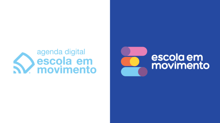
The concept of the video revolved around the gradual presentation of each brand, culminating in the reveal of the new identity of Rede Batista de Educação, which now unifies its sub-brands under a parent brand. Each step of the script was planned so that the audience could follow the transition smoothly and understand the network's evolution and new proposition.
- Script in stages. We organized the video as a sequence of presentations, brand by brand, until reaching the parent brand that brings them all together.
- Animations. The animations were designed to highlight the essential elements of each brand, using movement and rhythm to hold the viewer's attention.
- Kinetic typography. We chose kinetic typography to communicate the values and personality of each brand while giving the video a sense of continuity and cohesion.
the result for the Rede Batista
The launch of the new brands during the event was a success. The combination of visual elements with a well-structured narrative made the reveal informative and, at the same time, moving and memorable for those present.
The new visual identity of Rede Batista de Educação was well received and reinforced the perception of modernity and unity within the institution.
See other projects with Rede Batista, such as the corporate manifesto and the animated corporate anniversary video, and read about the role of the animated graphic package in visual identity.